I once wrote a post on how New York’s Medicaid spending, by age and by type of service, compared with the national average and nearby states, every couple of years. The “State Datamart” that allowed crosstabulations of the number of Medicaid beneficiaries and expenditures, by age and by type of service, disappeared after FY 2012, after fewer and fewer states had been included for several years. That data had allowed expenditures per beneficiary, by age group and by service type, to be calculated for each state, and the number of beneficiaries in each age group to be compared with the total population in that age group, and the population in poverty in that age group, by state.
Today there is a different set of data that has been posted, and I plan to tabulate what is available and write a couple of posts. The PDF report is here.
And the data is at http.//macpac.gov/macstats.
It isn’t what I was once able to get, but it is more than I’ve been able to find for many years. A quick comparison of total Medicaid expenditures in 2020, as a percent of the personal income of residents of each state, and what it cost those residents in state and local taxes, follows.
x
Here is a spreadsheet with total Medicaid expenditures, by state, as downloaded.
It is based on Exhibit 16 in the link above, divided by personal income data from the Bureau of Economic Analysis.
The data shows that total Medicaid expenditures equaled 3.47% of the total personal income of everyone in the United States. Not a surprise given that U.S. health care expenditures in general are approaching 18.0% of GDP (a figure that is larger than personal income), with public programs such as Medicare, Medicaid and the VA accounting for 55.4% of the total. Including health care funded indirectly by the government (private insurance purchased on behalf of government employees, tax breaks for other privately-funded insurance) the government total rises to 86.4% of spending that is not out of pocket. As showed in detail in this post.
Because Medicaid is a joint federal state program, however, spending varies by state. Since it would be hard to produce a bar chart with 51 (or rather 49) bars, I’ve attempted to use Tableau to produce a few thematic maps. I’m not very good at this, so bear with me. Alaska and Hawaii were deleted so the other states would be visible – their data, and the U.S. average, are in the text box at the bottom.
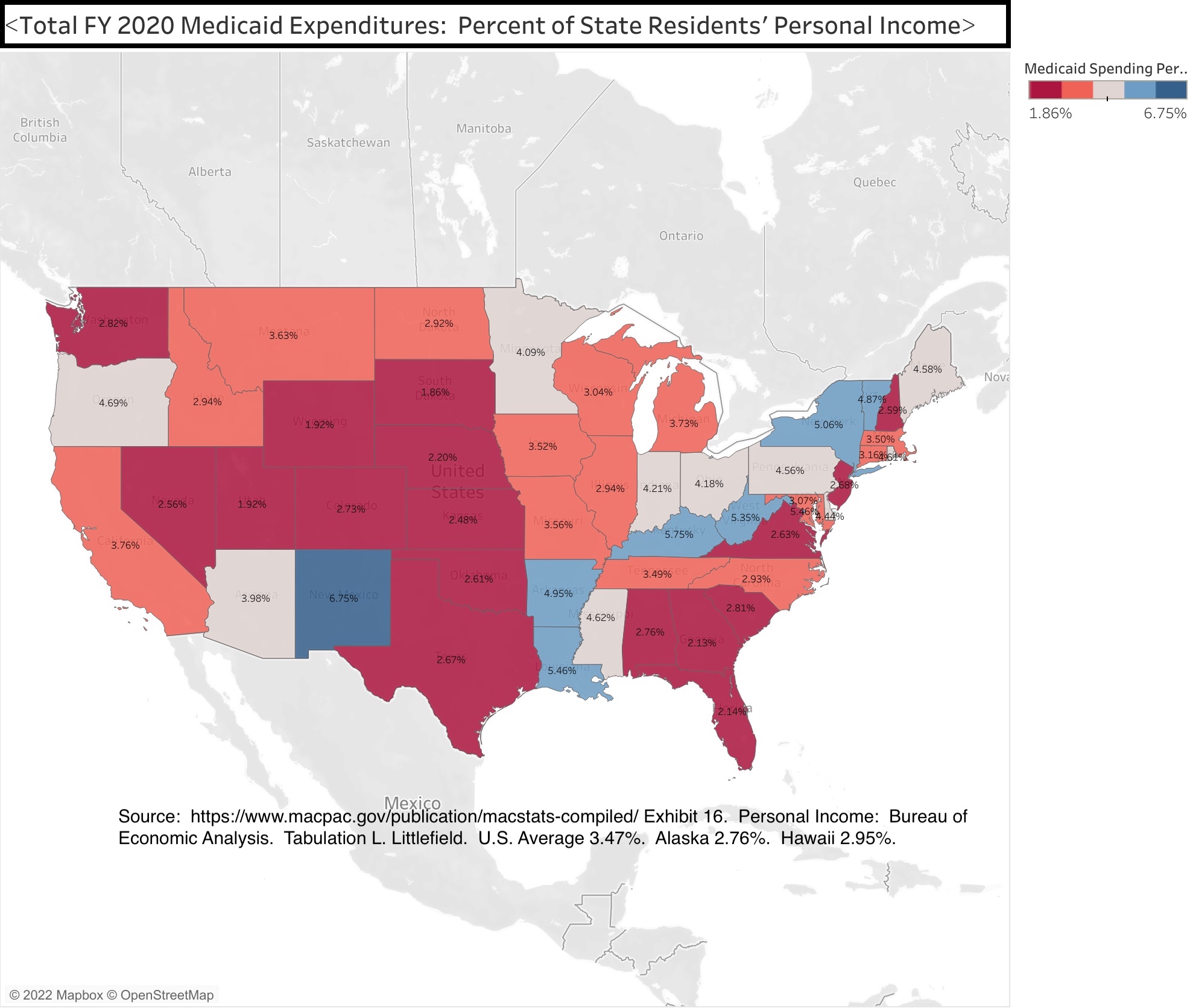
The data shows that New York State’s Medicaid spending equaled 5.06% of all the personal income of everyone in the state in FY 2020. That percentage only trailed a handful of other states where average incomes are much lower – West Virginia at 5.35%, Louisiana at 5.46%, Kentucky at 5.75%, New Mexico at 6.75%. Together with Arkansas at 4.95%, these states for a group for many of the maps that follow.
In the Northeast only Vermont, a lower income state that once tried to implement a state-run universal health care system, came close to New York State at 4.87% of state residents’ personal income accounted for by Medicaid.
The Northeastern states with relatively low per capita incomes for the region, such as Maine (4.58%), Rhode Island (4.61%) and Pennsylvania (4.56%) are moderately higher than the U.S. average in Medicaid spending as a percent of state residents’ personal income, while other Northeastern states are below the U.S average of 3.47%.
So is Florida at 2.14% of personal income, despite its large senior population, and most other Southern and Western states.
What explains some of these differences?
Medicaid was originally designed as a health care program for the poor, though middle class seniors requiring custodial care that is not covered by Medicare later accounted for much of the spending, because they were “medically needy,” and Medicaid was later expanded (in most states) to low- and moderate-income workers. American Community Survey data on the poverty rate in each state, downloaded from the Census Bureau, may be found in this spreadsheet.
The data shows that in 2019, before the pandemic, the U.S. poverty rate was 12.3%.
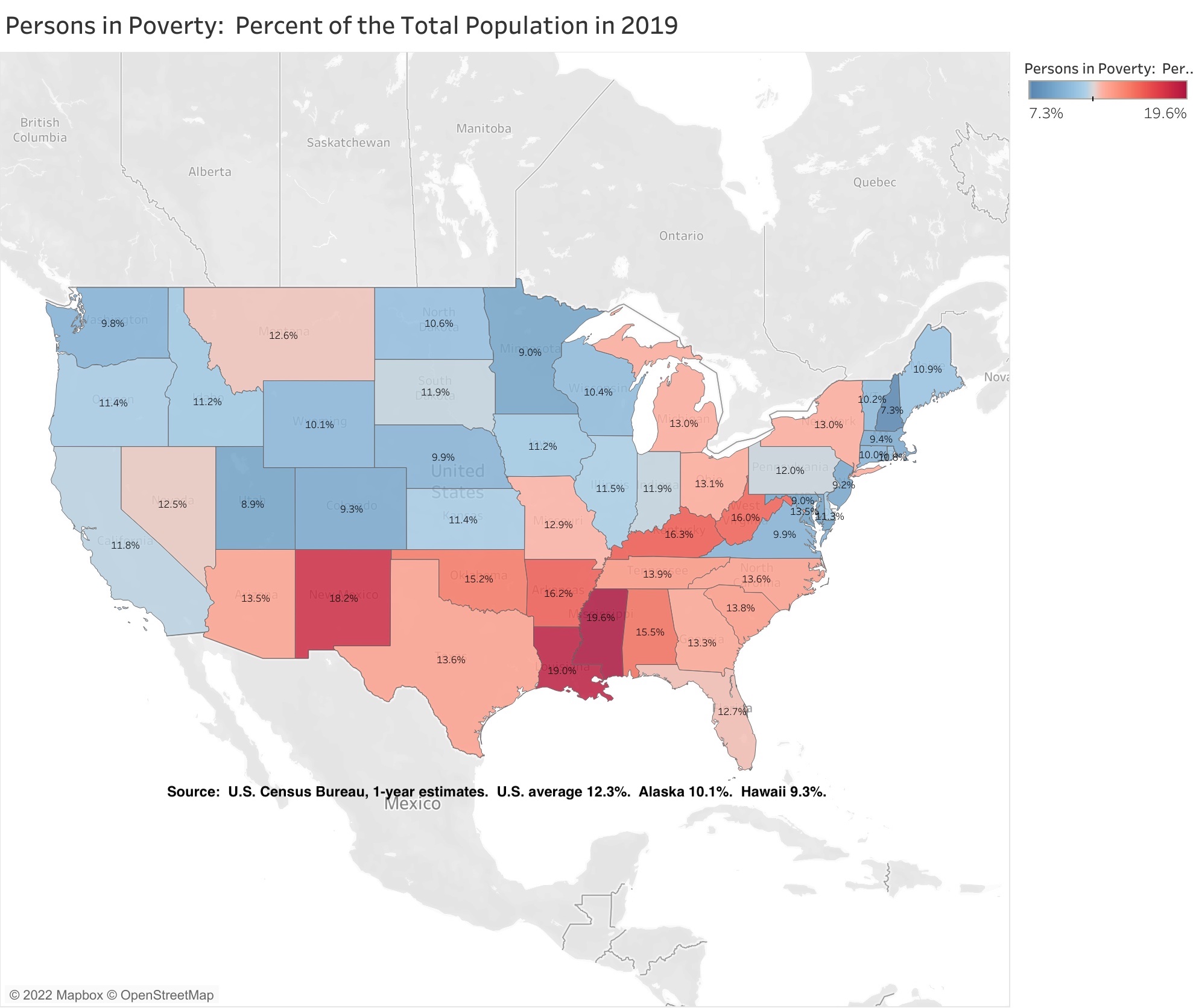
New York State’s poverty rate was above average at 13.0%, while all the other Northeastern states were below average. For a state with a relatively high per capita income, New York has always had a relatively high poverty rate, due to New York City’s role as a gateway city for less-well-off people from other parts of the country – and other parts of the world – seeking a better life. With the exception of the devastating decades for New York City from the mid-1960s through the early 1990s, many of those who arrived poor were able to use the city’s opportunities to advance out of poverty.
The extent to which New York State’s poverty rate exceeded the U.S. average was much smaller in 2019 than it had been in the past.
So was the gap between the poverty rate of New Yorkers born in the state (12.8%) and the poverty rate overall (13.0%). Unlike in the 1960s and 1970s, those moving in from other states are less likely to be poor, not more likely.
The other states with high Medicaid spending as a percent of their residents’ personal income have much higher poverty rates than New York – West Virginia at 16.0%, Kentucky at 16.3%, Arkansas at 16.2%, Louisiana at 19.0%, and New Mexico at 18.2%.
Yet it isn’t cash income that is the primary cause of people ending up on Medicaid. It is a lack of access to private insurance. With the advent of Obamacare, the American Community Survey started asking people about health insurance coverage. That data may be found in this spreadsheet.
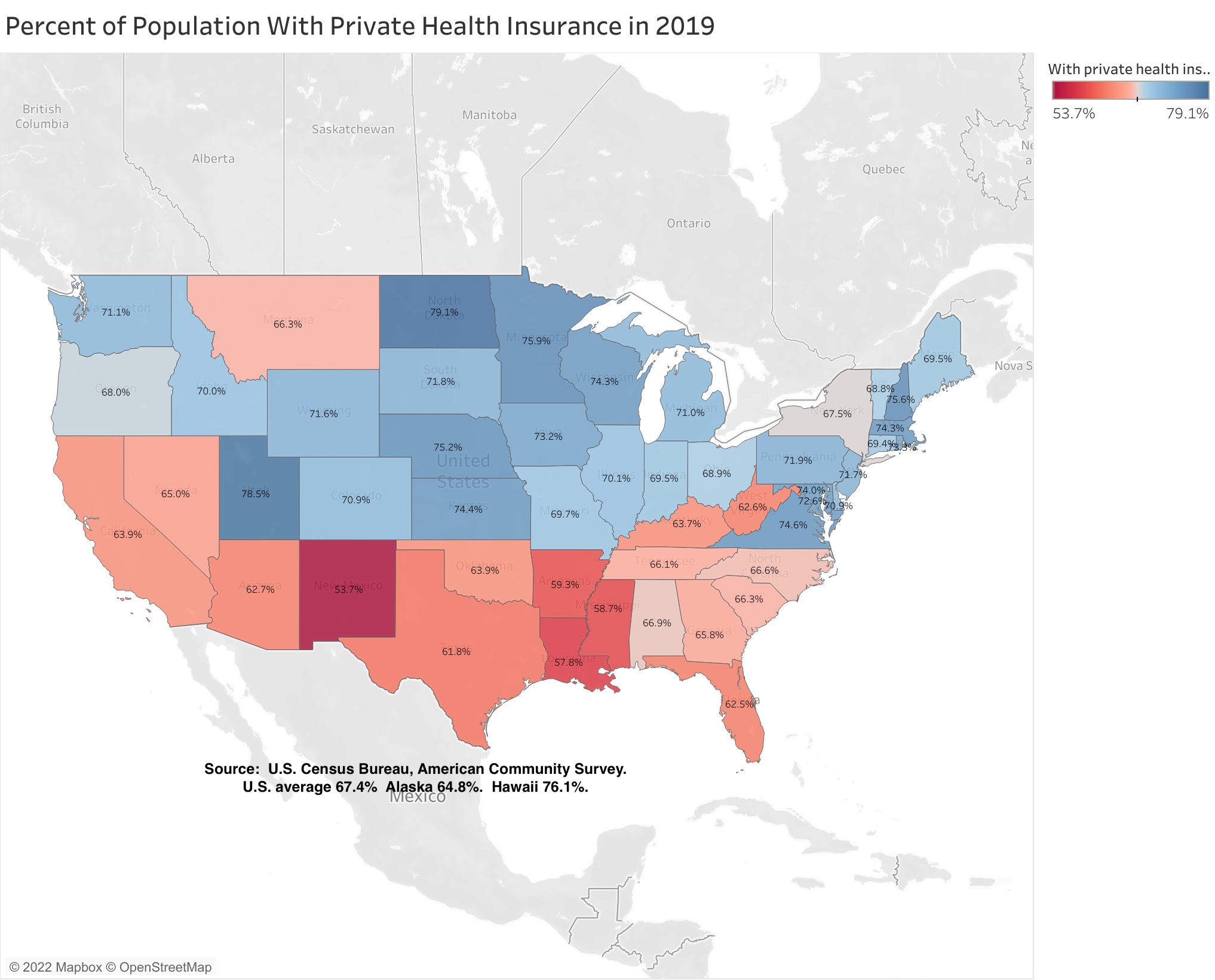
Low private health insurance access does not explain New York’s high Medicaid spending. In the U.S. as a whole, 67.4% of the population was covered by private health insurance, and New York was very close to the U.S. average at 67.5%. (Although in fairness, an unusually large share of that private insurance is probably accounted for by private insurance purchased with taxpayer money on behalf of public employees, retirees, and their relatives, as in metro DC).
The other states with high Medicaid spending as a percent of their residents’ personal income have a much smaller share of their population covered by private insurance than does New York – West Virginia at 62.6%, Kentucky at 63.7%, Arkansas at 59.3%, Louisiana at 57.8%, and New Mexico at 53.7%. So do most other southern states, plus Florida (62.5%) and Texas (61.8%). On the other hand, most of the Northeast and Midwest states have a higher percentage of their population covered by private insurance than New York.
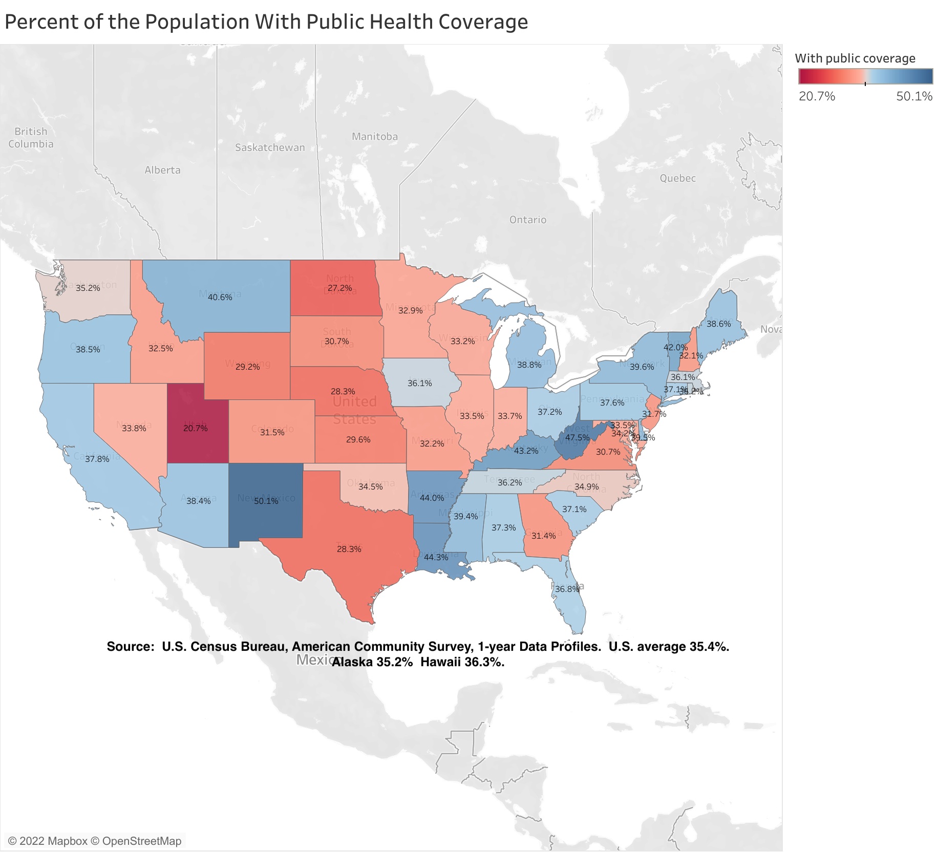
While its private health insurance coverage is average, the percent of New York State’s population with public health insurance coverage (39.6%) is above the U.S. average (35.4%). This includes not only Medicaid but also Medicare, so relatively old states would be expected to be above average by this measure.
Although above the U.S. average, the share of New York State’s population with public coverage is much lower than the other states with high Medicaid expenditures as a percentage of their residents’ personal income. These percentages are West Virginia at 47.5%, Kentucky at 43.2%, Arkansas at 44.0%, Louisiana at 44.3%, and New Mexico at fully 50.1%.
Getting back specifically to Medicaid, the level of expenditures in a state depends mostly on two factors – the share of the state’s population enrolled in the program, and the level of expenditures per enrollee.
There is often a tradeoff between the two. Health care is one of the industries where billing fraud is a respected practice. Health care providers decide how many people they want to hire and how much they should be paid, and then set out to find someone to cover that cost. Places that reduce public enrollment often find themselves billed for lots and lots of services per enrollee, while those that squeeze down expenditures per enrollee can find that enrollment is somehow jacked up – sometimes by customers from other states.
These two factors are found in the following spreadsheet.
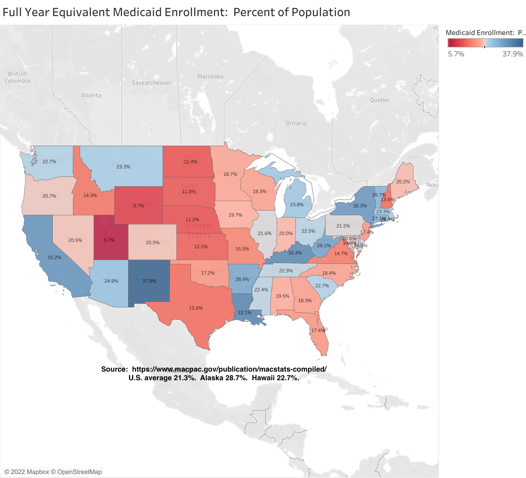
The data shows that while 21.3% of the U.S. population was enrolled in Medicaid, 30.3% of New York State’s population was enrolled, or nearly one-third. Here, finally, is a statistic for which New York is similar to states such as West Virginia (29.1%), Kentucky (32.4%), Arkansas (28.4%), Louisiana (33.1%), and New Mexico (37.9%). California is also high at 31.2%. I’ll speculate, based on history, why New York might be so far above average in the next post.
Texas is far below average at 13.6%. That state’s public education spending is higher than many people would think, once it is adjusted for the average level of income and thus the cost of living in the state. In fact, it is higher than California’s. Health care is what the State of Texas doesn’t’ spend on. Florida is also below average, with Medicaid covering just 17.4% of the population, despite all those seniors.
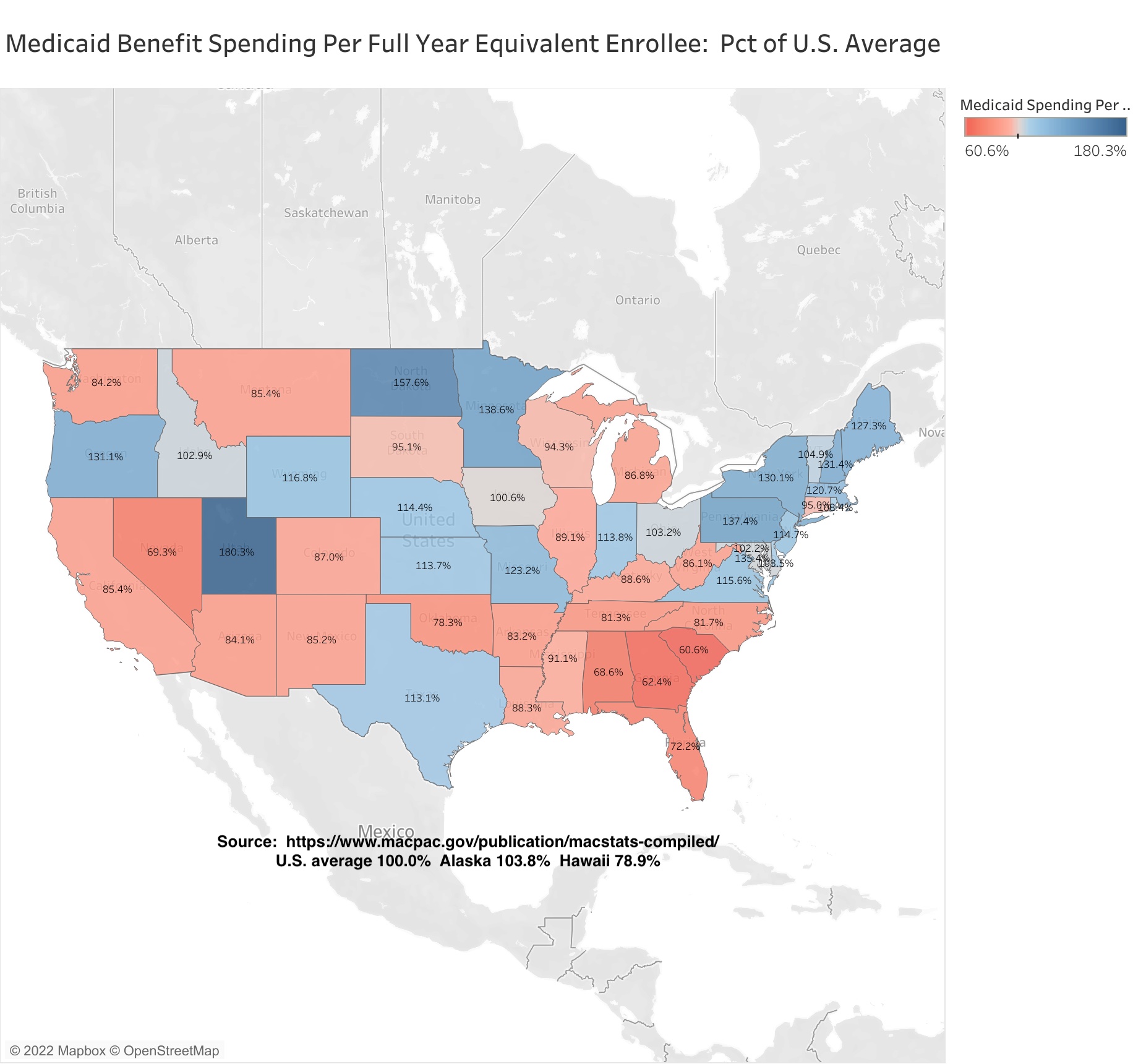
New York State’s Medicaid spending per enrollee was 30.1% higher than the U.S. average. That is one of the highest in the country, but the extent to which NY is above average is much less than it had been in the recent past. The oldest data I have on my current computer is from 2002.
Back then New York State’s Medicaid spending per beneficiary was 87.2% higher than the U.S. average, or nearly double. The average for surrounding Northeastern states was 32.1% above the U.S. average, or about what New York State – and surrounding states – are today. This despite New York’s spending per beneficiary on Physicians being one-third lower than the U.S. average, and one of the lowest in the country. Back then Local 1199 and the Greater New York Hospital Association were the most politically dominant, rapacious, selfish and entitled special interest in New York, a position now occupied by the United Federation of Teachers and New York State United Teachers. (NYC school spending is now double the U.S. average).
Today the gap between New York and the U.S. average is smaller, but to get there I’ve read that New York State froze its Medicaid reimbursement rates for the state’s once politically dominant hospital and nursing industries for 15 years, a big cut relative to inflation. Finally, after all that, New York’s Medicaid spending per enrollee is more in line with nearby states, at least in total. It is also more in line with per capita income.
Places with higher per capita incomes, and higher overall wage and salary levels, also tend to have higher costs of living. That means that wages and salaries in the public sector, and in substantially publicly-funded sectors such as health care, have to be proportionately larger as well, for their jobs to be competitive. Perhaps not entirely – public and publicly-funded workers tend to get vastly richer benefits, including health benefits, that most private sector workers, especially in New York – but to an extent. That’s why I usually adjust the level of public spending here, based on either per capita income of the average private sector wage, to make it more fairly comparable with U.S. average. Obviously Upstate New York and Downstate New York are very different in that regard, but for Medicaid all I have is statewide data.
The following is per capita income, based on Local Area Personal Income data from the U.S. Bureau of Economic Analysis.
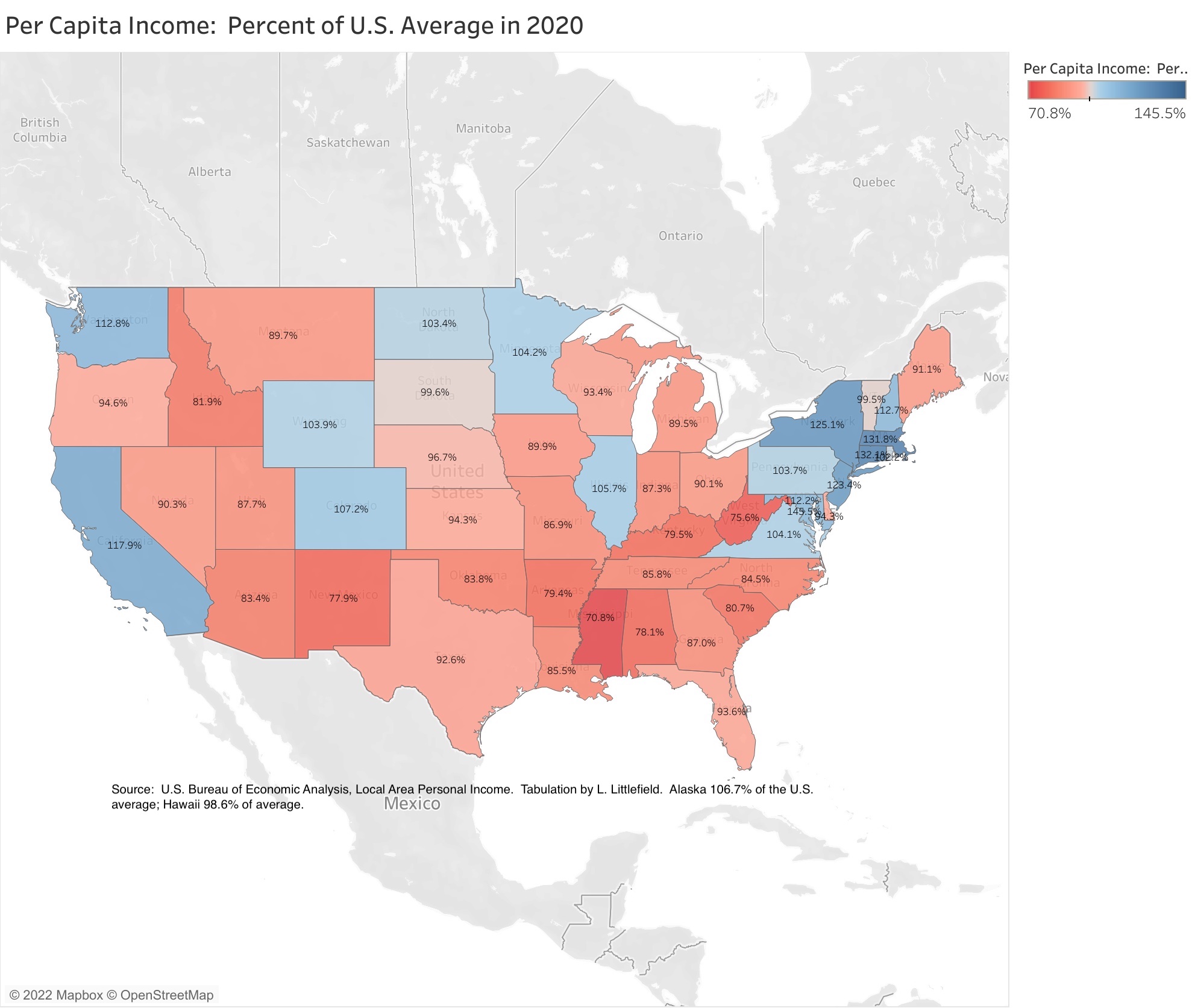
That data shows that New York’s state average per capita income was 25.1% above the U.S. average in 2020, and about the same percent above average each year since 2017. That is still less than New York’s Medicaid spending per enrollee, at 30.1% above the U.S. average, but it is a smaller gap than in the past. In 2002, when New York State’s Medicaid expenditures per beneficiary was 87.2% above the U.S. average, its per capita income was just 16.5% above the U.S. average – New York’s Medicaid-funded health care workers were fabulously rich compared with most of the serfs who were paying for them.
And while much of the total income may be concentrated at the top, in recent years New York state’s overall per capita income has exceeded the U.S. average by the most since the 1940s – despite the decline of Upstate New York. That is not guaranteed to continue. New York State’s per capita income was just 6.5% above the U.S. average back in 1979, when we had the opposite of the asset price bubbles we have had recently.
Critically, per capita income is the sole basis of the federal funding formula that determines the share of a state’s Medicaid expenditures that the federal government will cover – and thus the share that will have to be paid for in state and local taxes. A relatively high per capita income has meant that New York’s base federal share for most Medicaid expenditures has been at the minimum 50.0% during virtually the entire history of the program. Poverty is not part of the formula, so states with relatively high per capita incomes but also above average poverty – New York and California – have been disadvantaged over the years.
Some types of Medicaid expenditures that have been added to the program since the 1960s – Child Health Plus, the Obamacare expansion – carry higher federal shares than the basic program. In addition, the federal share of the basic Medicaid program was increased by 6.2 percentage points during the COVID-19 pandemic.
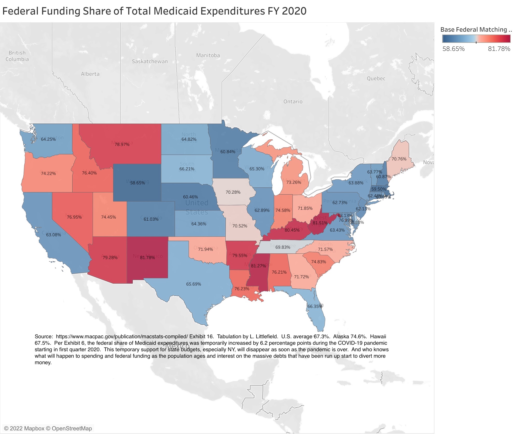
As a result, the federal government paid for 63.9% of all Medicaid expenditures in New York State in 2020, compared with the U.S. average of 67.3%. More than in the past, but less than the other states with very high Medicaid expenditures as a share of state residents’ personal income – West Virginia (81.5%), Kentucky (80.5%), Arkansas (79.6%), Louisiana (76.2%), and New Mexico (81.8%). In those states, state and local taxpayers aren’t paying for high Medicaid expenditures. New Yorkers are paying, in federal taxes.
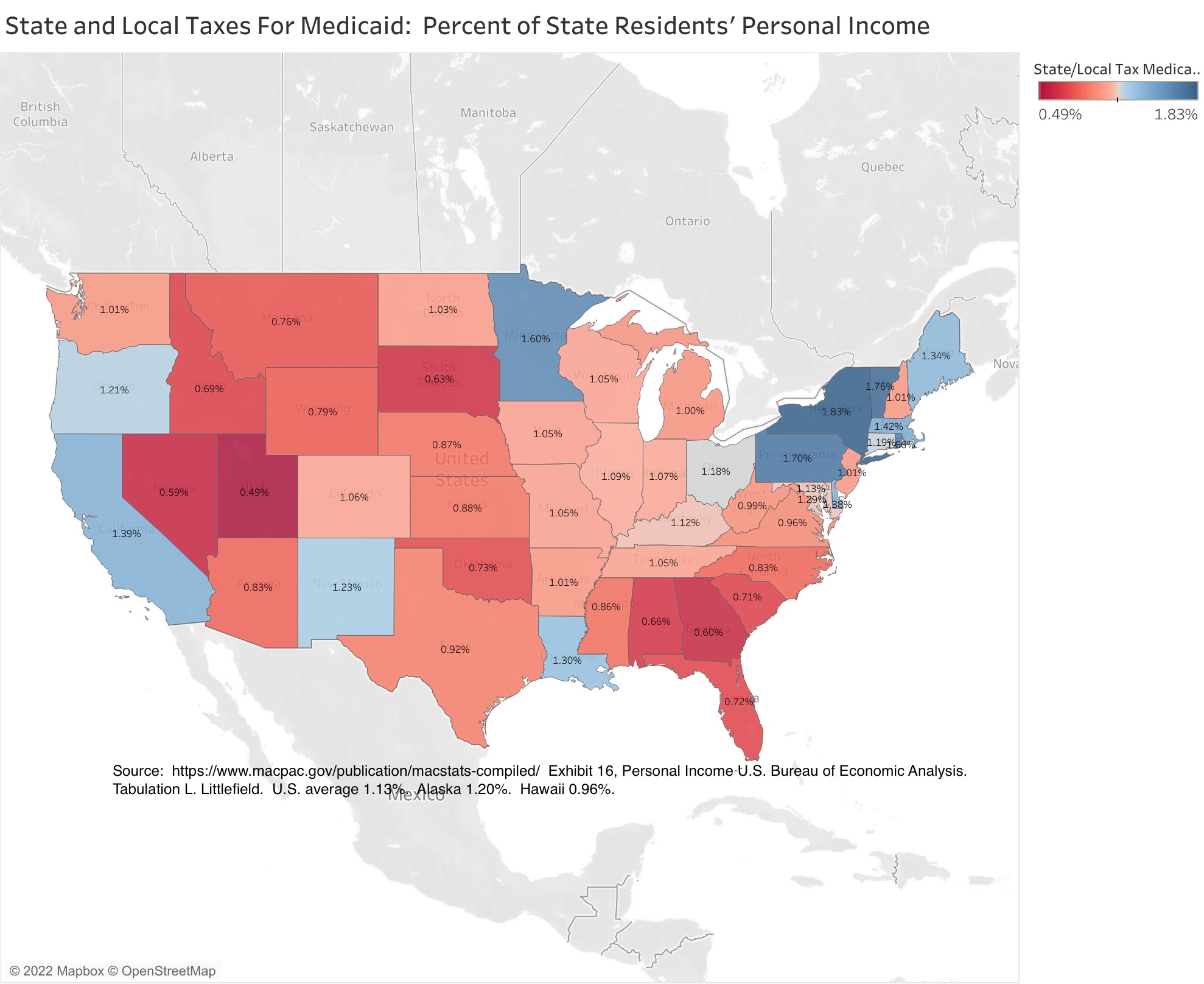
New York State’s high Medicaid spending combines with its low federal share to create the nation’s highest state and local tax burden for Medicaid, at 1.83% of state residents’ personal income compared with a U.S. average of just 1.13%. To put that figure in perspective, the average state and local government tax burden in the U.S. is generally around 10.00% of personal income, though it is much higher than that in New York, especially in New York City, the highest in the country. The extra 0.70% of income for Medicaid contributes to this.
Some other states are close to New York’s burden, but not the states that New Yorkers are moving to. Texas is at just 0.92% of income, and Florida at 0.72%. And with much of New York’s Medicaid spending concentrated in New York City, and New York being the only state where local taxes cover a large share of the burden, the cost of Medicaid to New York City taxpayers is even greater.
The other states where the state and local tax burden of Medicaid comes closest to New York are Pennsylvania, the nation’s oldest state, Vermont and Massachusetts, states that have aspired to universal health insurance coverage, and Minnesota – despite the latter state having a below average level of Medicaid enrollment as a percent of the population.
One factor that has increased New York’s Medicaid expenditures over the years is people from less generous, low-tax states who come here for health care when they get sick, paid for in part by the people of New York. They have a cup of coffee to quality as New York residents for Medicaid, with the members of the Greater New York Hospital Association happy to do the paperwork to get the added revenues, receive expensive care, and then go back to the low tax state where they are from. And seniors from New York who head for low tax Florida when they are rich and healthy, but return to New York for expensive custodial care when their health fails and their money is gone. Since these people are only enrolled in New York’s Medicaid program when they require expensive care, their Medicaid expenditures per enrollee are very high.
I wonder if something else is happening in Minnesota, home of the Mayo Clinic?
In any event, New York State’s Medicaid program remains a crushing burden on state residents, with Medicaid enrollment compared with population similar to that of poor states, the federal government covering a low share of Medicaid expenditures, as in rich states, and total expenditures per enrollee above the U.S. average by more than per capita income is. These factors multiply by each other to produce the nation’s highest state and local tax burden for Medicaid as a percent of state residents’ personal income.
Still, the damage is not as bad as it was the past, and is far less than 15, 20, or 25 years ago.
The following post will examine Medicaid enrollment and expenditures for population subgroups by state, to the extent that information is available.

Pingback: Medicaid by State and Age Group in FY 2019: Curiouser and Curiouser | Saying the Unsaid in New York